 neonency
Figma to WordPress: how a design becomes a pixel perfect website
The real process behind turning a Figma file into a fast, editable WordPress site, and how to prepare your design so nothing gets lost.

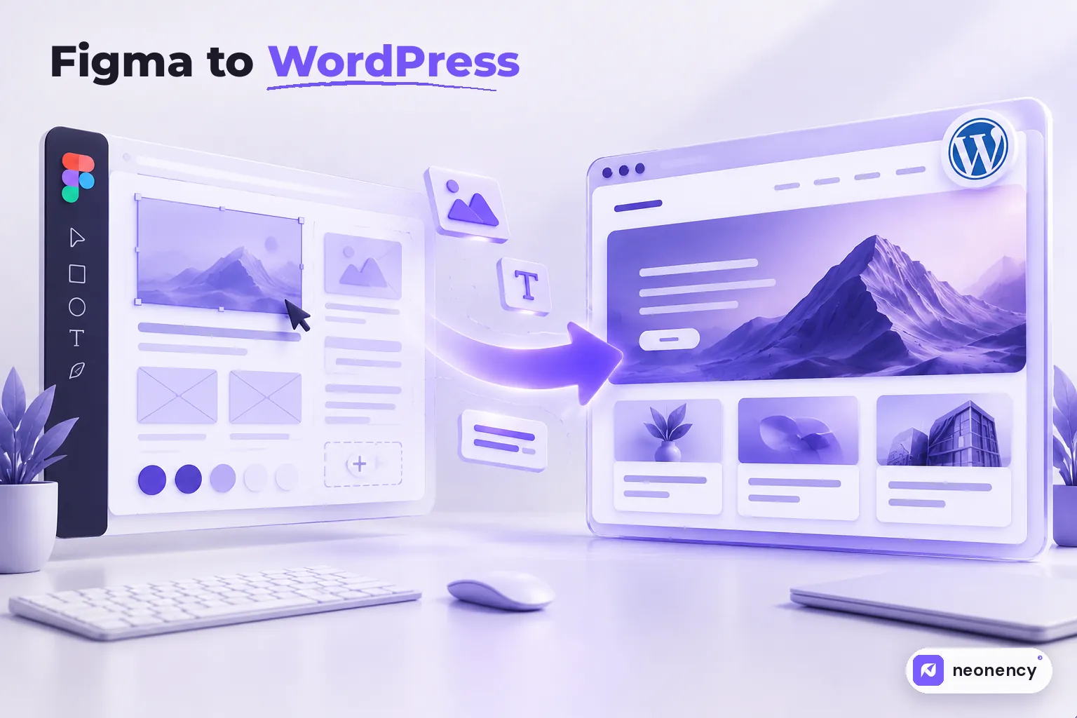
To turn a Figma design into WordPress, a developer reviews the file, sets up global styles (colors, fonts, spacing) from the design, builds each layout as a reusable template using Elementor, the block editor or a custom theme, connects editable content to the CMS, makes it responsive for every screen size, then tests it against the design before launch. A typical 5 to 8 page site takes about 1 to 3 weeks.
Figma to WordPress is one of the jobs I do most often. Agencies send a design, I send back a live website. Simple on paper.
In practice, the gap between a beautiful Figma file and a beautiful website is where projects either shine or fall apart. Spacing drifts. Fonts look heavier. The mobile version gets "figured out later." This guide walks through how a careful build actually works, and what you can do on the design side to make it go smoothly.
Step 1: review the design before writing any code
The first hour on a project is spent just looking. I go through every frame and check:
- Unique layouts. How many different page templates are there? A 10 page site often has only 4 or 5 unique layouts.
- Components. Are buttons, cards and forms built as Figma components, or does every page have slightly different versions?
- Breakpoints. Is there a mobile design? A tablet design? If not, we agree how things should collapse before building.
- States. Hover effects, open menus, form errors, empty states. These often get forgotten in design and then invented during development.
- Content. Is this real text or placeholder? Real content changes layouts, especially headings that are three times longer than the dummy text.
Any questions go back to the designer at this stage, all at once. It saves days of back and forth later.
Step 2: turn the design into global styles
Before building pages, I set up the design system inside WordPress: colors, fonts, heading sizes, button styles, container widths and spacing.
This is the step that makes a site feel consistent. If the H2 style is defined once, every H2 on the site matches. If it is styled by hand on each page, you get twenty slightly different headings and a site that feels "almost right."
If the designer used Figma variables or a clear style guide, this step is quick. Figma's Dev Mode, on paid plans, also makes it easier to inspect exact values and export assets.
Step 3: choose how to build it
There are three main ways to build a Figma design in WordPress, and the right choice depends on who will edit the site later.
| Approach | Best when | Trade off |
|---|---|---|
| Elementor (or another page builder) | Your team wants to edit layouts visually | More code on the page, needs care for speed |
| Block editor with a block theme | You want native WordPress editing and good performance | Fewer visual design controls for editors |
| Custom theme with custom fields | You need maximum speed and strict control | Editors change content, not layouts |
I go deeper into this choice in Elementor vs custom theme. The short version: there is no wrong answer, only a wrong match.
Step 4: build templates, not pages
A good build is made of reusable pieces. The header, footer, service card, testimonial block and call to action section are built once and reused everywhere.
That matters for two reasons. The site stays consistent, and future edits take minutes instead of hours. Change the card once and every card on the site updates.
Blog posts, case studies and team members go into WordPress as proper content types, so editors fill in fields instead of rebuilding layouts by hand.
Step 5: make it responsive properly
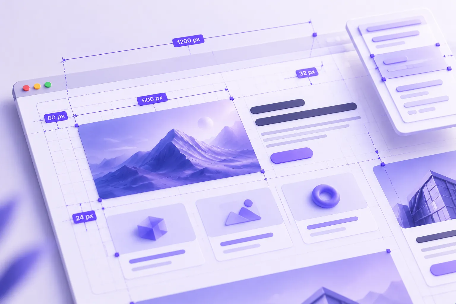
This is where most "pixel perfect" claims break down. A design is drawn at fixed widths, usually 1440 pixels for desktop and around 375 for mobile. Real screens come in every size in between.
So I build with flexible layouts and fluid type rather than locking everything to exact pixel values. The site matches the design at the designed widths and still looks intentional at 1280, 1024, 820 or whatever size someone's browser happens to be.
Images get exported at sensible sizes and in WebP. SVG for icons and logos. Fonts loaded locally with only the weights the design uses.
Step 6: connect the content and the details
Now the site gets wired up:
- forms connected to email or a CRM
- SEO titles, descriptions and Open Graph images
- redirects if this replaces an old site
- analytics and consent banners if needed
- animations, kept subtle and fast
Step 7: test it against the design
Before handover, every page gets checked side by side with Figma, at desktop, tablet and mobile widths. I use an overlay tool to compare spacing and alignment, then test on real phones, not just a resized browser window.
Then the boring but important checks. Forms send. Links work. Page speed is good, ideally passing Core Web Vitals. Nothing breaks when an editor adds a very long heading.
How to prepare your Figma file for a smooth build
If you are the designer or agency, these habits make a real difference:
- Use components and auto layout for repeated elements.
- Name your frames clearly, like "Home, desktop" and "Home, mobile."
- Design at least desktop and mobile for every unique template.
- Define text styles and color styles instead of styling each layer by hand.
- Include hover states, menus and form states.
- Use real or realistic content, especially for headings.
- Note any animations with a short description or a reference link.
My take
The best Figma to WordPress projects feel like a relay race with a clean handoff. The designer thinks through the details, the developer respects them, and the client gets a site that looks exactly like what they approved and is easy for them to update.
If you have a design ready and need it built, whether you are a business or an agency working white label, send us the Figma link. We will come back with questions, a timeline and a clear price.
Frequently asked questions
Can Figma export directly to WordPress?
+
There are plugins and tools that try, but the output usually needs a lot of cleanup and is hard to edit. For a fast, maintainable site, a developer rebuilding the design properly is still the reliable way.
How long does Figma to WordPress take?
+
A 5 to 8 page site usually takes 1 to 3 weeks, depending on how many unique layouts there are, custom features, animations and how quickly feedback comes back.
Should I use Elementor or a custom theme for my Figma design?
+
Elementor is great when your team wants to edit layouts visually. A custom theme or block theme is better for performance and long term control. It depends on who will edit the site and how often.
Do I need a mobile design in Figma?
+
It helps a lot. At minimum, design the desktop and mobile versions of each key page. Without a mobile design, the developer has to make layout decisions for you, and they may not match what you had in mind.